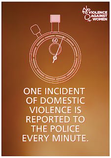
Its pretty much been a day project due to low productivity as of late (which I believe is directly correlating with my complete lack of exercise / lack of post-viva stress), so I decided to do some designs for the No To Violence Against Women campaign!
I pretty much started the research by looking for some examples of Stats that showed how big of an issue this was in the UK and I was quite astounded by how bad it really was :/ The original idea was to show these vectors in brusing on the skin backgrounds but it looked crappy, I instead opted to use the colours of the campaign, white and red in the illustrations instead...


Not to sure what I think of them, but meeeh. Some feedback would be nice...
Anyways, time to start designing my website... JOY!
M x

One and two, the first in particular look fine.
ReplyDeleteImages, background and logo work together well.
The text, especially on the third needs a look at, the "shape" of the paragraph needs to be tidied. Perhaps use less lines, it shifts the balance of the image to the text so looks a bit odd.
I agree, I've tried re-wording that fact a few times and can't get it to look right. I wanted to keep consistency in the text size but couldn't really get it down. I thiiink I've got it now, but you shall see when it's re-uploaded later.
ReplyDeleteThank you Anon!
it should be 'a woman' on the third not 'a women' :)
ReplyDelete